A New RSS Link
When I switched from the old Tumblr to Github Pages, I got a surprising amount of email about my RSS feed. If I didn't screw things up, it should be here.
Also, for those of you who are curious, this site was created using Jekyll, an amazingly easy way to set up static sites. Shan Carter showed it to me in the fall, and we used it for our data visualization syllabus at Berkeley and Amanda and I are using it now for our class at NYU. It's great!
The RSS feed uses this implementation more or less verbatim.
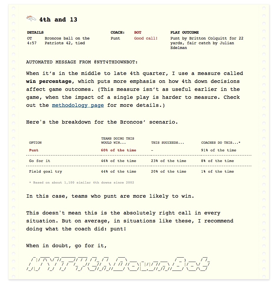
NYT 4th Down Bot
For most of the fall, some colleagues and I developed NYT 4th Down Bot, a news application that analyzed N.F.L. 4th down decisions in real time. I had been thinking about a project like this for a long time – Amanda Cox forwarded me David Romer’s paper at least three years ago – but the fall of 2013 was really the first time I felt like I was equipped to actually make a project like this happen.
Earlier in the year, while working on a graphic about the draft, I had spoken with Brian Burke, the creator of the popular football analytics web site Advanced NFL Stats. I explained my idea to him (roughly, a web site that analyzed every 4th down of every game) and asked him if he'd be willing to create an API for his 4th Down Calculator for a joint venture once the season started. He said yes, and I told him I'd be in touch in a few months.
The app turned out to be complicated. We're watching a live data feed of every NFL game (provided by a Canadian company called SportsDirect), processing the feed to determine the situation and result of the play, hitting an API representing Brian Burke's 4th Down calculator with that game situation, processing the response and publishing new data files to S3. There is no real backend, no database and no static content – just a bunch of Node scripts publishing JSON files every 15 seconds anytime an N.F.L. game is happening. (Not by design...it just happened that way. I'm not opinionated about these sorts of things.)
Start to finish, the whole process took about a minute. (Before Tom Giratikanon got involved, it took a lot longer than that – without him, the app would still be sitting on my Desktop.)
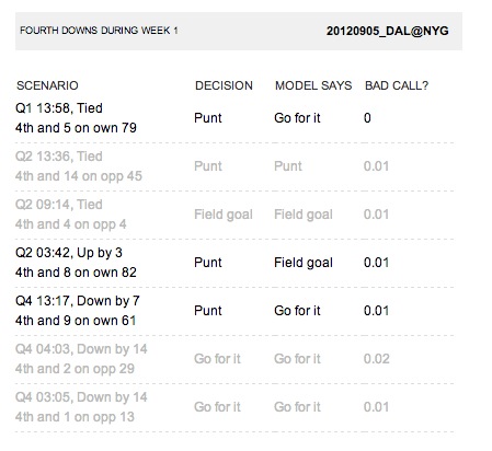
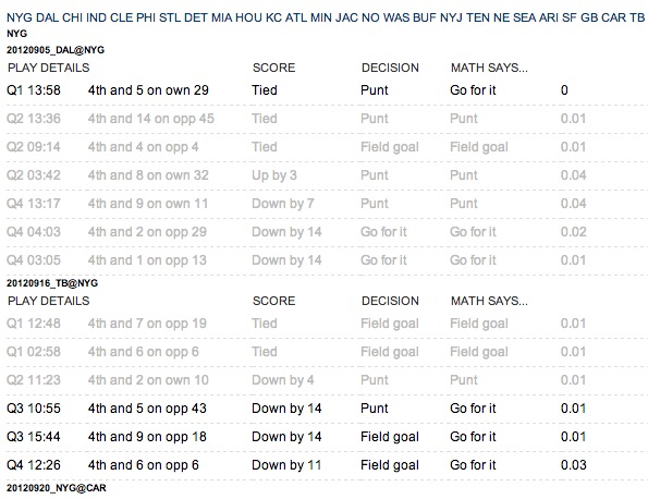
My first sketches were simply small tables designed for a phone using data from the 2012 season.
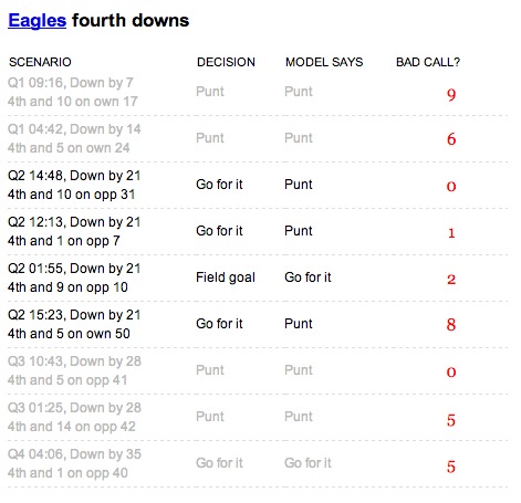
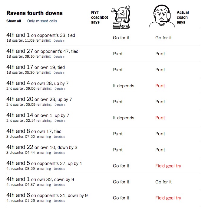
As the concept became clearer, the tables became bigger, more interesting, and much more opinionated.
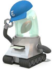
I had been working on a demo for weeks before Shan Carter and Jen Daniel suggested the idea of personifying Brian's model. (Originally, the tables simply compared "Coach says" to "math says", clearly boring in retrospect.) This first started with "NYT Coachbot", a flat vector drawing from Jennifer.
We then started giving the robot more of a mouth.
A few sketches later, we were emphasizing the throwback style of 1980s computers and printers in the bot’s reports.
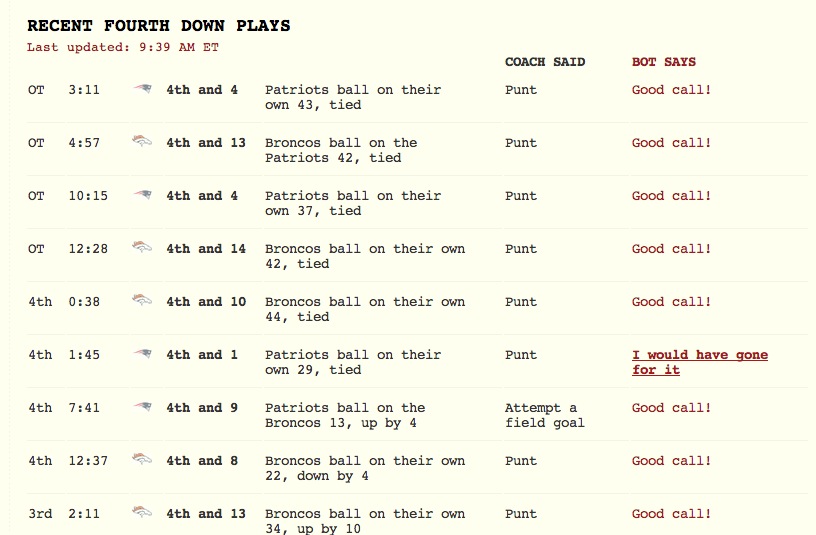
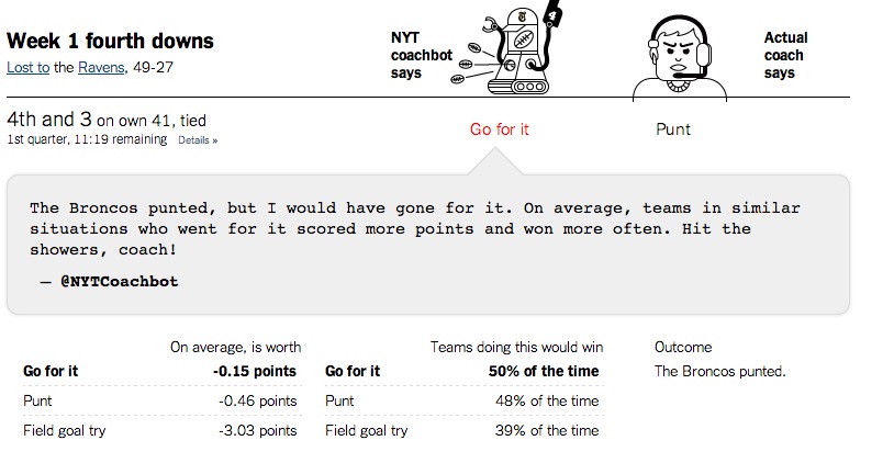
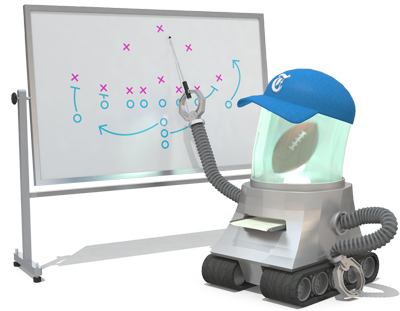
The more we designed, the more we realized most people would be coming to the "play" pages directly from Twitter, so we had to make them as clear as possible to the uninitated – this is why each robot decision comes with a dead simple sentence that says exactly what it is.
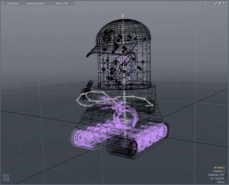
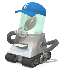
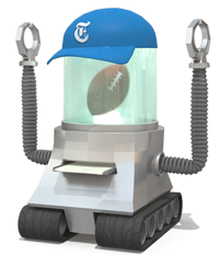
The drawings and renderings are from Jennifer Daniel and Shan Carter, who worked in a back-and-forth style, bringing the bot to life using Modo and Adobe Illustrator.
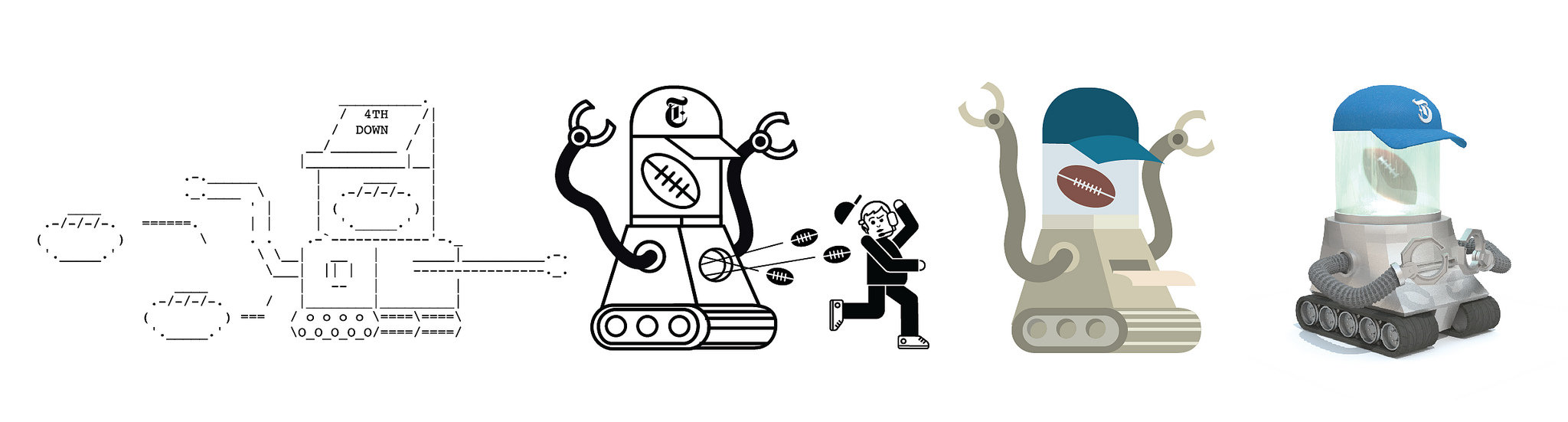
And what that looks like in Modo, the 3D program Shan used to render it.
Here are some of Jennifer's thoughts on reactions he could have. (Bummer about "ashamed" bot's lack of self-control.)
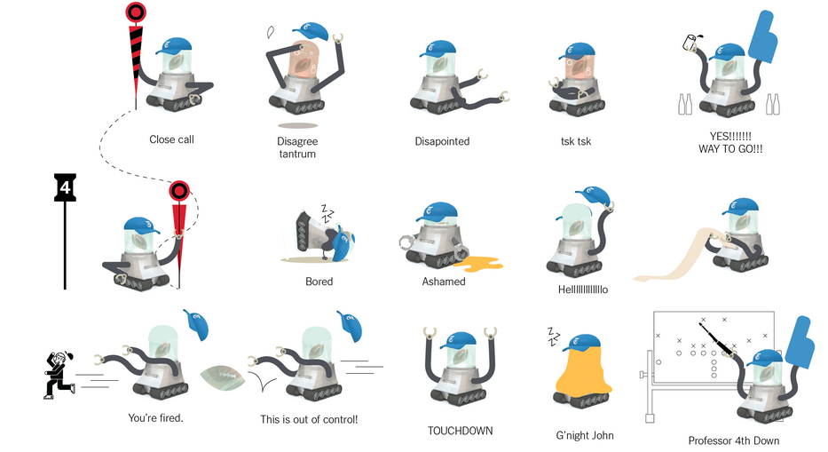
In the end, we didn't make all those poses, but we did do a lot of fun ones that really brought the concept to life. Here are all the things the 4th Down Bot liked to do (including dogging you for making nachos). It even fooled our friend Lynn Cherny when it signed off one night, which is almost as great as that time it was a copy editor on the foreign desk.
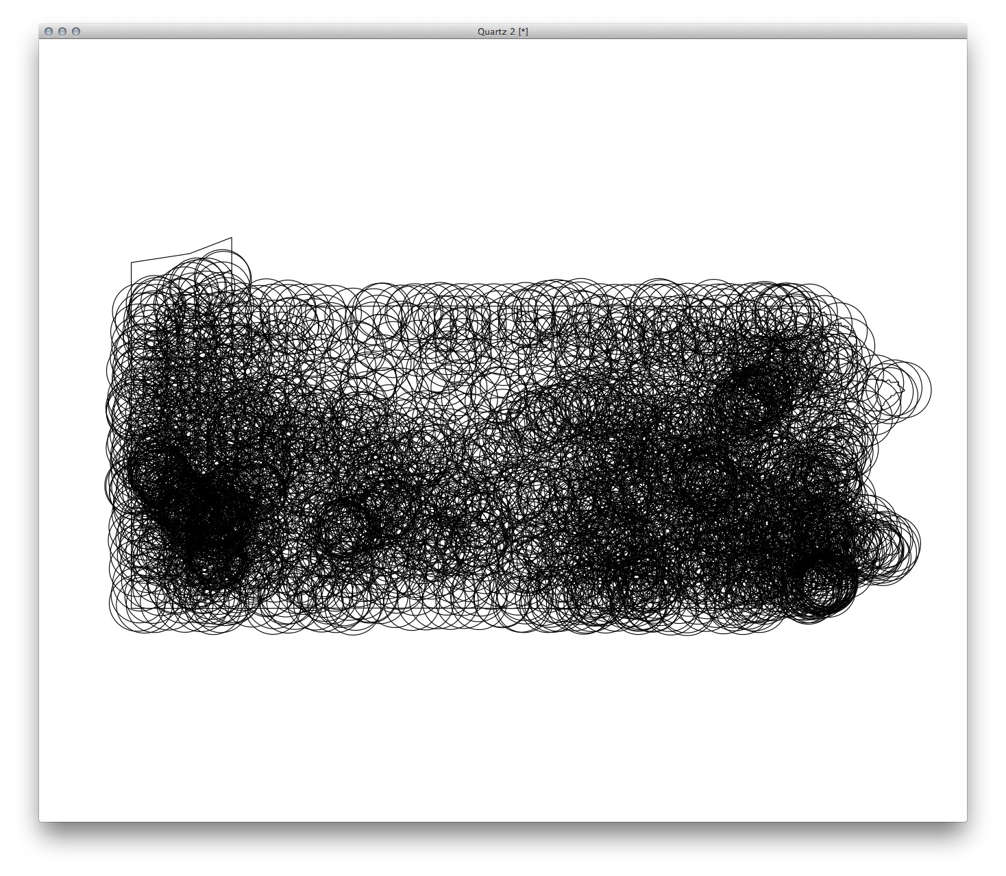
Here are all the poses Shan put the bot in at one point or another:


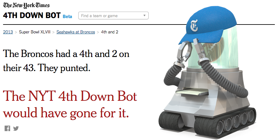
By the end of the season, it had more than 10,000 Twitter followers and caught the attention of various famous economists and CEOs of Twitter.
Still, it's certainly not perfect. Here are some things that are wrong with it:
It probably took too long to launch. We published around Week 13. Officially, we missed our goal by only five days, but in retrospect we could have published something less polished and improved it as it gained momentum. (This is hard for us newspaper people to do.)
It could feel more “live”. The lag between the end of the play and the analysis takes about a minute, but sometimes the delay on the play-by-play data lagged a bit, which meant you were getting bot analysis well after the other team started its drive. This isn't ideal, but there just wasn't much we could do about it.
Because it was programmed to analyze decisions that already happened, some aspects of N.F.L. play aren't captured well. For example, when a team intentionally takes a penalty on 4th and 1 near midfield, the bot applauds the punt on 4th and 6 without properly scolding the 4th and 1. This particularly annoyed Aaron Schatz of Football Outsiders, who later got over it.
As many statisticians noted, it could display uncertainty better than it does. From my perspective, that's the most legitimate criticism, and we hope to improve on it next year.
Still, although we're biased, we think it was a successful, well-executed project and a novel use of technology for news. Tom Giratikanon even gave the project his highest praise: both "worth doing" and "not the worst."
Here's a list of notable NYT 4th Down Bot links for the offseason (and if there are others, I'm happy to add them):
An intro post from Brian Burke when it was launched. "Even I'm tired of analyzing 4th downs."
A thoughtful critique from a statistician's perspective.
I talked about it on the Advanced NFL Stats podcast.
Neiman Lab wrote a feature on it.
Gigaom wrote a long post about it and then did a longer feature on Brian Burke, who developed the statistical model that drives the bot.
For some reason, it had something to do with brands and content strategy, though to be honest, this article makes little sense.
Nate Silver devoted a few paragraphs of his ESPN magazine cover story on the bot.
We're hoping to introduce a cousin or two this summer, too. If not, well, preseason is only 6 months away.
19 Sketches of Quarterback Timelines
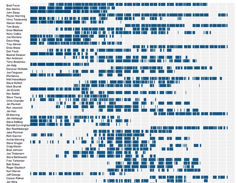
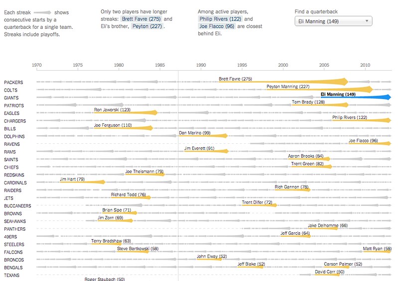
On Sunday Eli Manning started his 150th consecutive game for the Giants, the highest active streak in the NFL and the third-longest streak in NFL history. (One of the other two people above him is his brother, Peyton.)
The graphics department published an interactive graphic that put Eli’s streak in the context of about 2,000 streaks from about 500 pro quarterbacks. The graphic lets you explore the qbs and search for any quarterback or explore a team to go down memory lane for your team.
It’s not particularly important news, but the data provided by pro-football-reference is incredibly detailed and the concept lended itself to a variety of sketches. It was also good practice sketching in D3, which, once you memorize a few things, isn’t as painful as I had thought. (Being in SF for the fall makes learning easier, too, since I can interrupt Mike more easily when he’s sitting one desk over. )
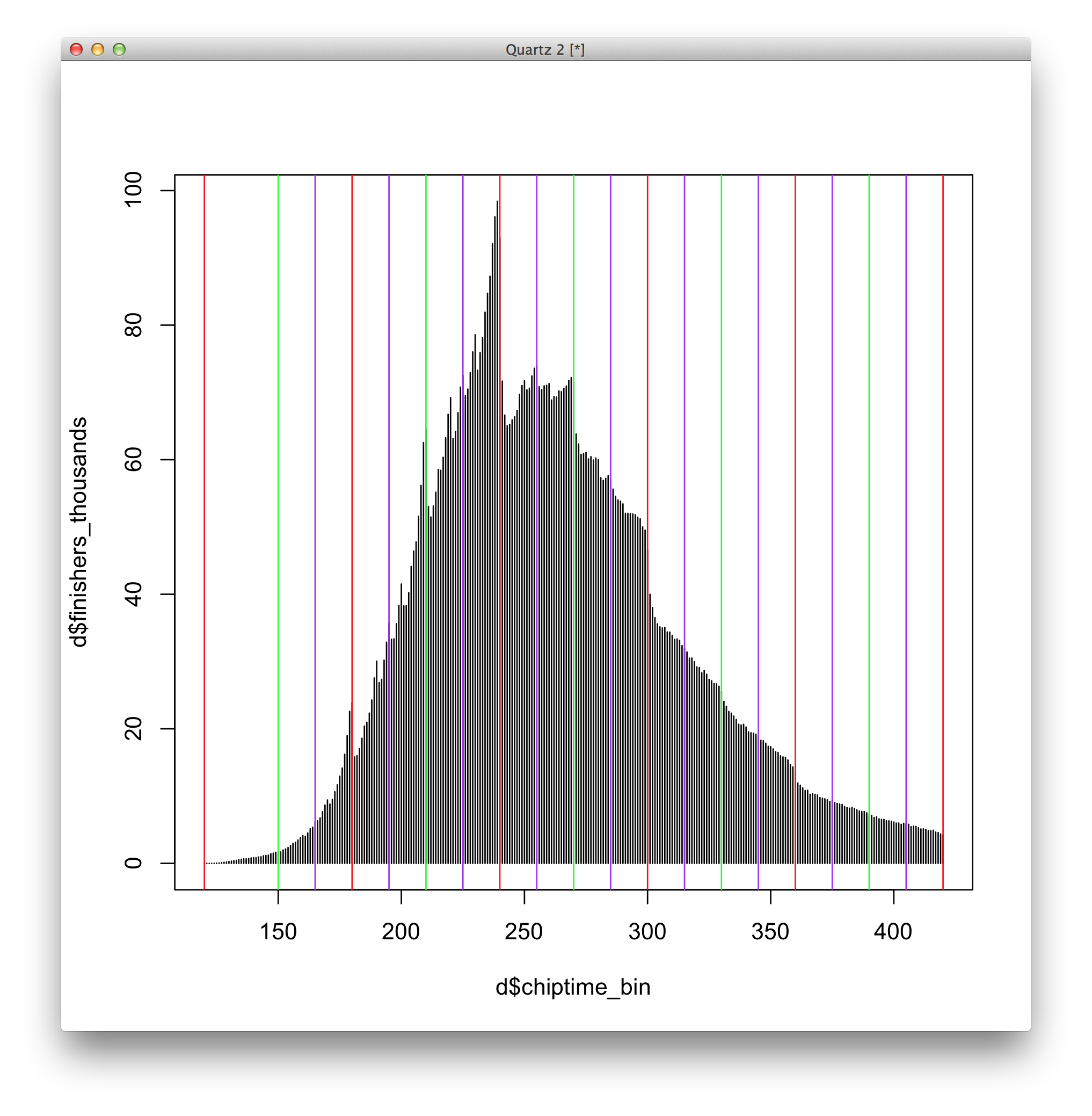
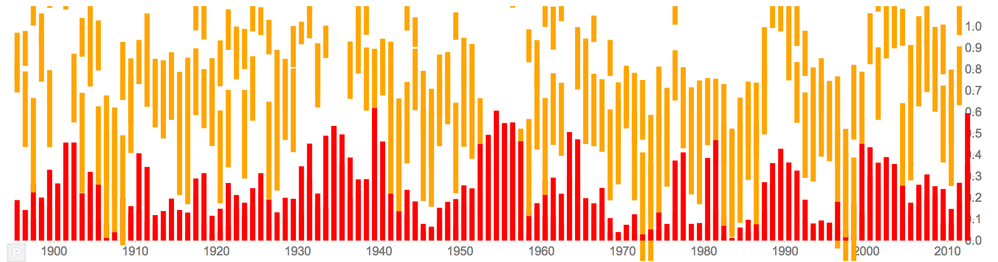
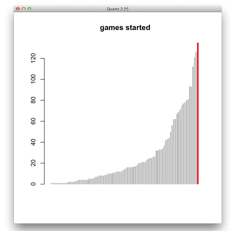
A couple bar charts in R. First, total games started (this compares Eli to QBs in his draft class or later).
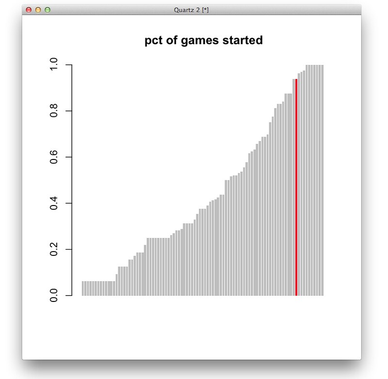
And percent of games started (the people are 100% are players like Andrew Luck or RGIII who just haven’t played a lot of seasons.)
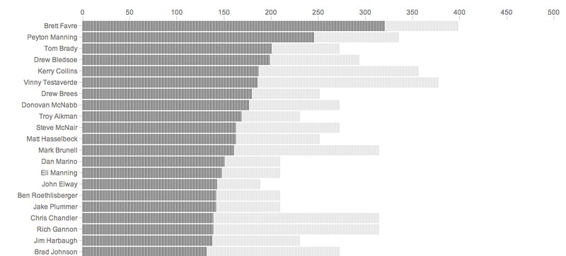
Ported to a browser, just using total starts:

And share of total possible starts
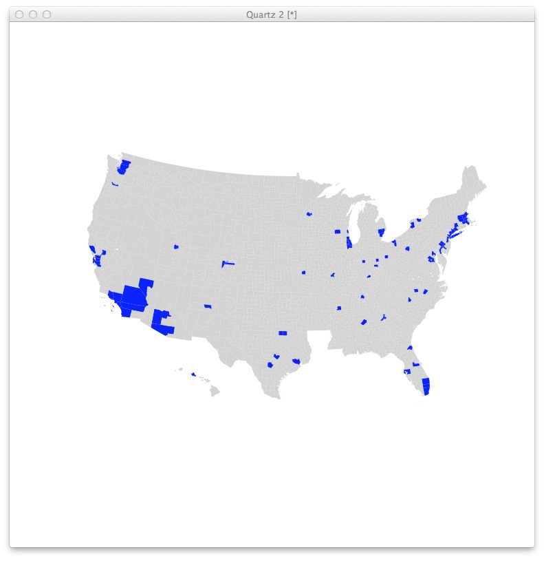
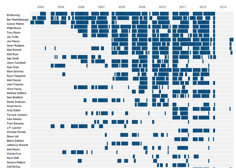
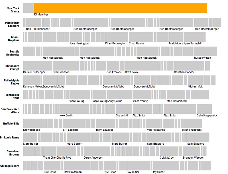
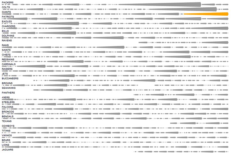
A different angle, showing teams with all the QBs who have started for them since 2004. (Sorry, Cleveland Browns.)

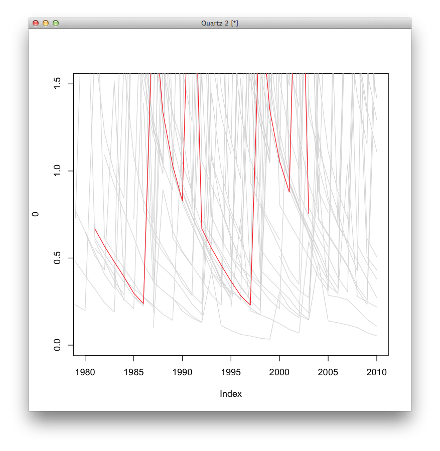
A similar idea, but mapping when each quarterback played for a particular team
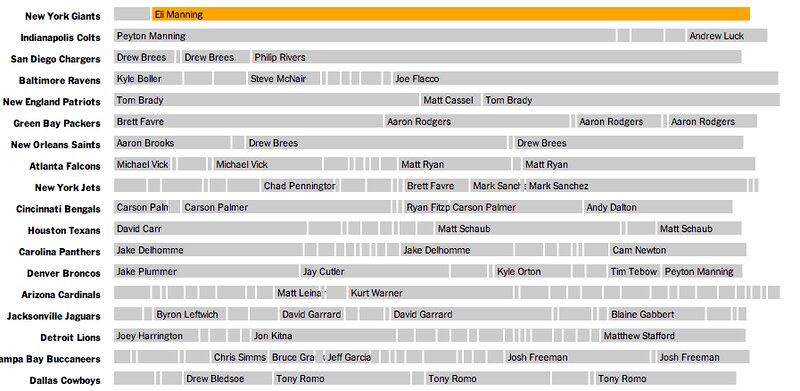
Or just showing all the quarterbacks, regardless of team, going back to 2004…
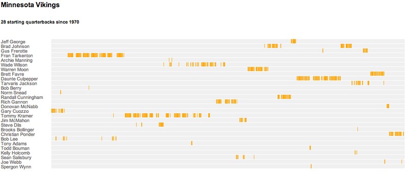
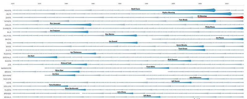
…or all the way back to 1970
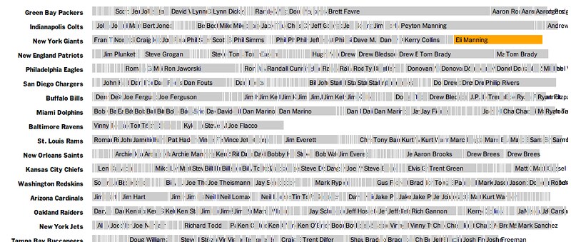
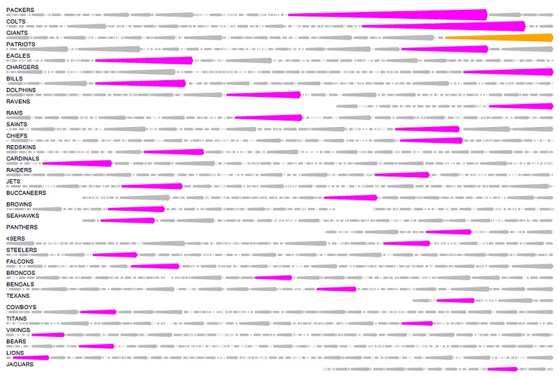
Focuing on the teams took up less space, with a new color for each new QB. (Please wear sunglasses.)

Simplifying the output, only labeling prominent quarterbacks:
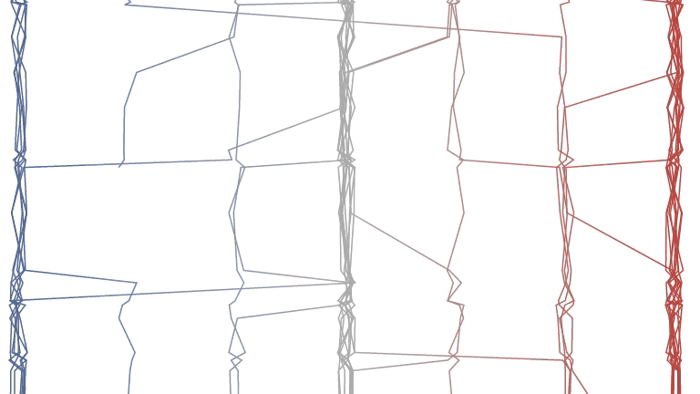
At this point this was the general thought, but there were still some thougts on what the bars could look like. Lines were one option:
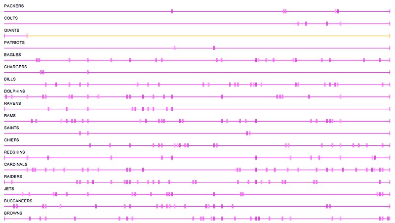
And then some more streak-like streaks, which eventually became more like arrows and less like, I don’t know, whatever you think these look like:
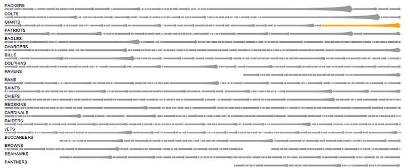

And the eventual one published Sunday, with search and fullscreen mode: