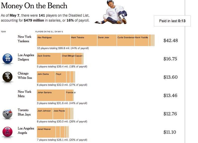
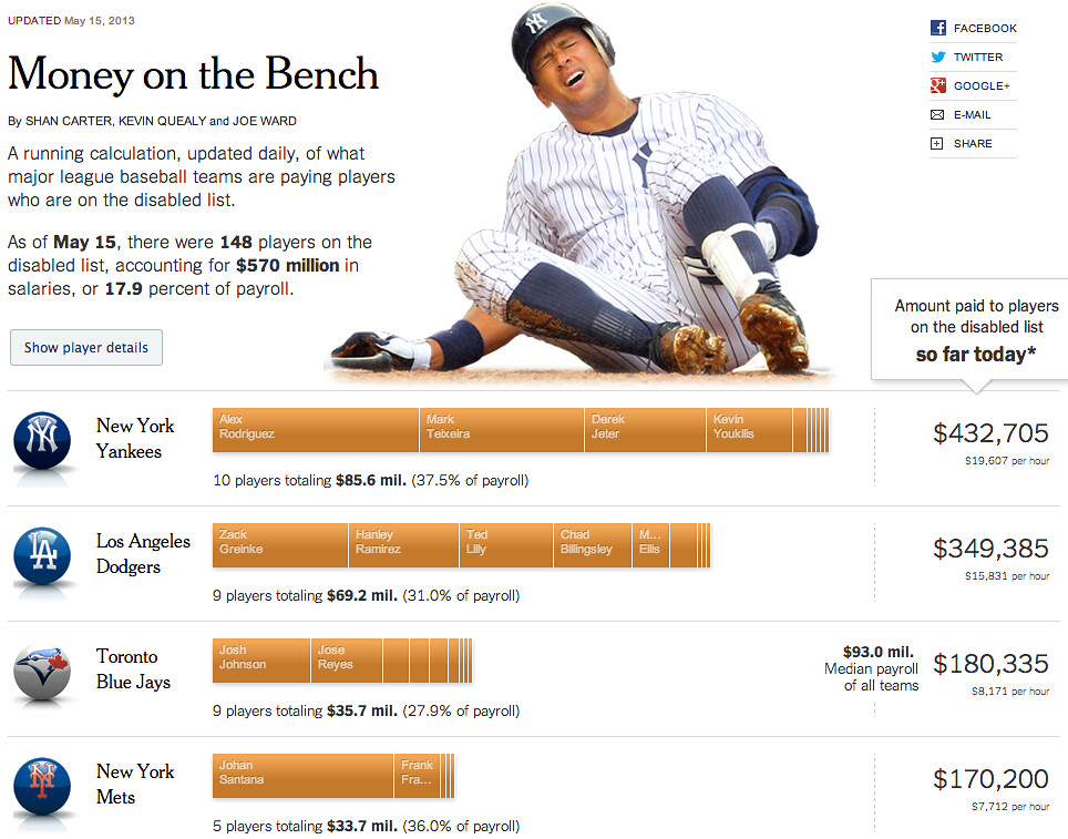
On Monday we published something a little different than most of the graphics we make – a running, updating tracker of how much money major league teams are paying to players on the disabled list.
I love sports, but I’m not a huge baseball fan and I’m neutral on the Yankees scale – I don’t really hate them but I can’t say I care whether they win or lose. But early in the year, I remember seeing a fun New Yorker cover that planted a seed:

Talking to some friends and colleagues, Joe Ward and I thought it would be fun to do something that put a dollar figure on the Yankees’ disabled list. We certainly weren’t the first people to notice this – in addition to coverage from traditional outlets, the Onion wrote about how “stacked” the D.L. was and there was a well-circulated blog post when their payroll approached $100 million in annual salaries – but we wanted to make something that showed all major league teams and was updated throughout the season. To do that, you only need two data sources: salaries for every player in the league and a list of all major league transactions, both of which are updated regularly.
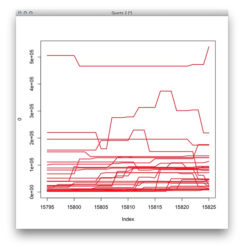
We wanted users to be able to find their own team, but also to see the big picture. Some of our original sketches focused on the amount spent per team per day. Below, a chart where each line represents one team’s amount paid to players per day (the jumps and dips represent players coming on and off the list):
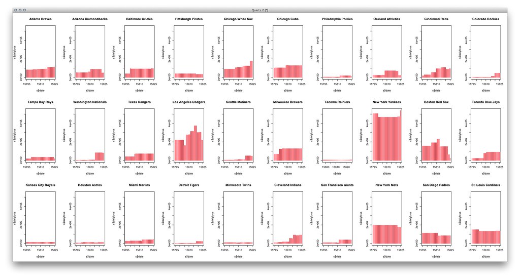
Another sketch showed the teams as small multiples:
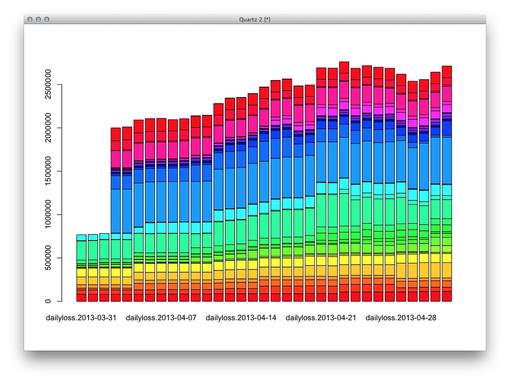
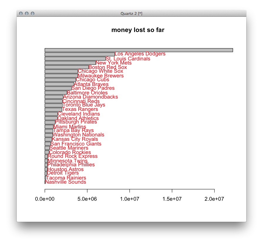
And another used stacked bars (poorly):
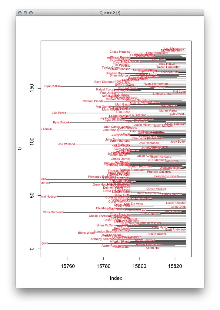
Or one that just showed the players on the bench and how long they’d been on it, regardless of team or salary:
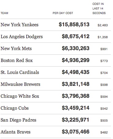
But the one that stuck out the most in the end was the simplest – an aggregate per-team calculation:
With that, we started developing things in the browser. The following are sketches made with D3 based on the previous R charts.
Originally, this started as an idea for a phone with just a couple numbers per team. (These sketches are old and the numbers are calculated incorrectly… I screwed some things up.)
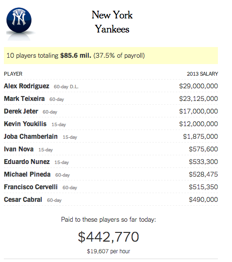
But we also wanted to see individual players. Here, a first attempt at the data join in D3:
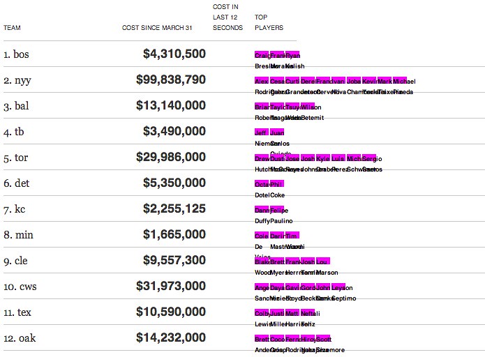
Later, hooking it up to real salary data:
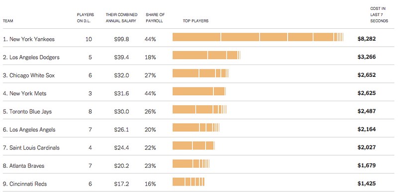
And making it a little less boring (or “adding sugar,” as Shan says)
Before coming to the version that’s online now:
We still kept a mobile view that I think turned out as well or better than the desktop version:
Is this an earth-shattering example of data journalism? I suppose it is not. It’s two data sets, a timer and and a giant photograph of A-Rod updated a couple times a day. But I must say I like it. It’s fun and engaging for the users it’s aimed at; it’s not tied to a single news event but it’s not aimless either; it was developed and published in less than two weeks; it works on all sorts of devices and it updates every day (originally an R script running on a crontab, now a node script). It’s also a good example of using D3 to make data-driven applications without using SVG at all.
Normally I show what we did in print, but in this case, we didn’t make anything. Most of the fun of this is seeing the numbers tick up in front of you (Shan’s idea) as you’re on the page. In print, it’s just another bar chart. At the same time, if something happens, we’ll be ready on short notice with all the data we need.