In last Sunday’s, paper Mike McIntire and Michael Luo published their investigation into White House visits by large Democratic donors. As simple as the chart was, we pondered many complex options before publishing it.
Early on, I thought some large-scale visualization of all major donors might be interesting, so I plotted a couple hundred of the top donors (based loosely on first and last names) with donations and WH visits on the same axis to see if there was any meaningful pattern. It looked like this:
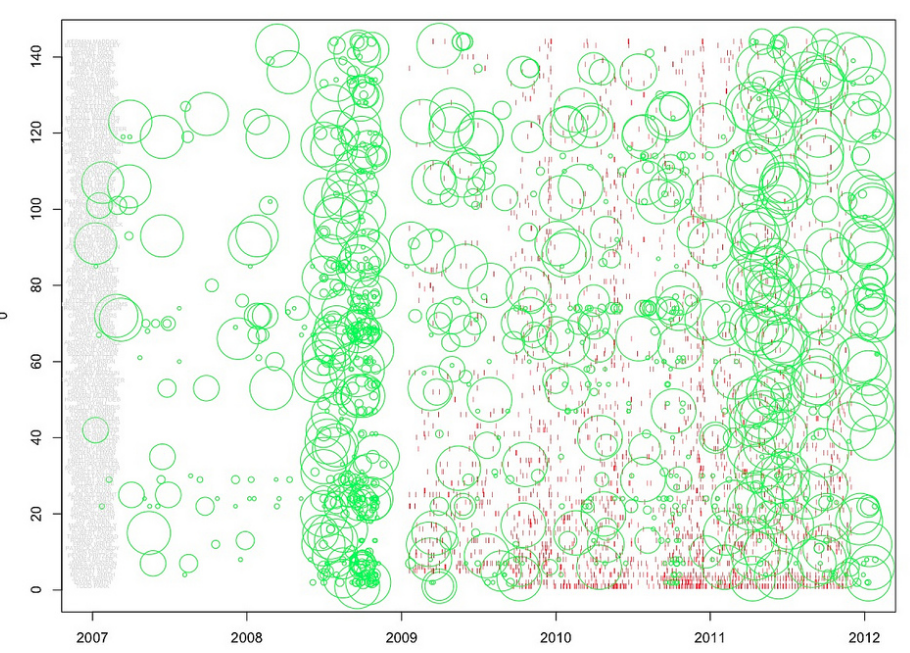
Although it looked sort of cool (in a meaningless data-art kind of way), nothing there illuminated the real focus of the story – namely, the possibility that large donors might get more access to the White House. Really, that was my only idea, and I was being annoying and complaining about it when Amanda Cox matter-of-factly told me to make a sketch that showed the percent chance of visiting the White House based on one’s total donation size. An hour later, I had this:
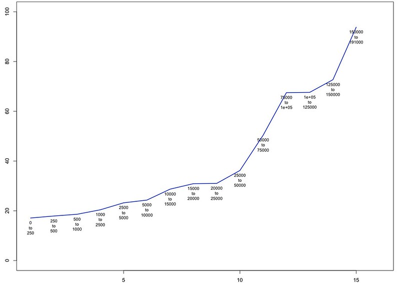
We all liked it right away. Most of the remaining work went to matching the databases of donors and visitors as well as we could. That data work is important, but horribly unsexy and not really conducive to sketches. In general, we matched on middle initials where we could, and Matt Ericson helped me implement his handy Mr. People gem to get the various names parsed in a uniform fashion. Otherwise, all the data work was done in R, with a typically heavy-bordering-on-embarrassing level of assistance from Amanda.
Once we published, there was some discussion about the form of the chart on Twitter, and I admit it’s slightly odd. We had a lot of discussion about form on our end, too. So I present 4 options, each named for a delightful animal (we do a lot of animal-based filenames in the department, for some reason):
First, the “Blue Whale,” arguably the most straightforward, accessible approach. This form makes the trend the focus of the graphic: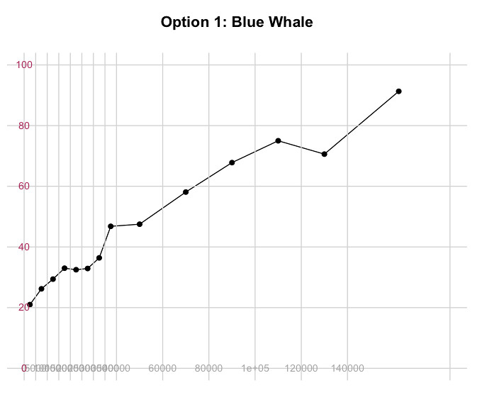
"Polar Bear" is perhaps the best chart for a more technical audience…
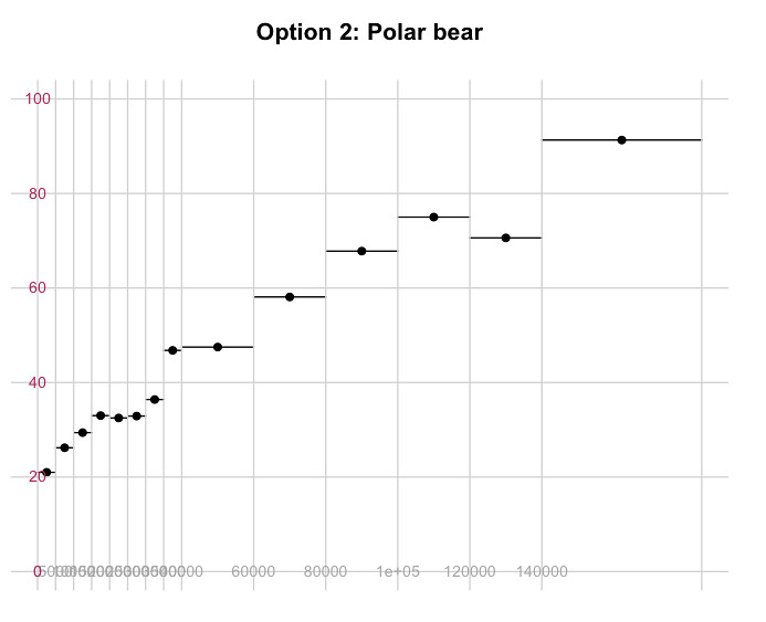
…but it might mean fewer people understand it. And is it me, or do the horizontal segments look like error margins instead of donation ranges? It’s not quite a scatterplot, since the percentages plotted represent “buckets” of donation sizes rather than individual points.
A slightly different approach, the “Tree Lobster" might indeed be the most accurate representation of this dataset:
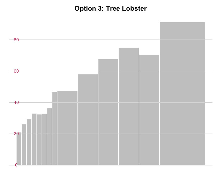
But where’s the continuity? And seriously, how boring are bar charts? Also, labeling is hard on this thing, which is not a trivial problem.
Lastly, (Dull) Giraffe:

Seriously, this one is dull and maybe not worth discussing. Or is it? Discuss. Any discussion of these forms might happen on Twitter under the hashtag #chartingSpiritAnimals until I figure out how to put comments into this site, which, let’s face it, isn’t ever going to happen.
If you’ve seen the graphic online or in print, you’ll know that we went with the Blue Whale. Aside from carrying the crucial Steve Duenes/Matt Ericson/Amanda Cox voting bloc (their decisions somehow track the majority vote 100% of the time), it felt suited for the data and the story it was published with.
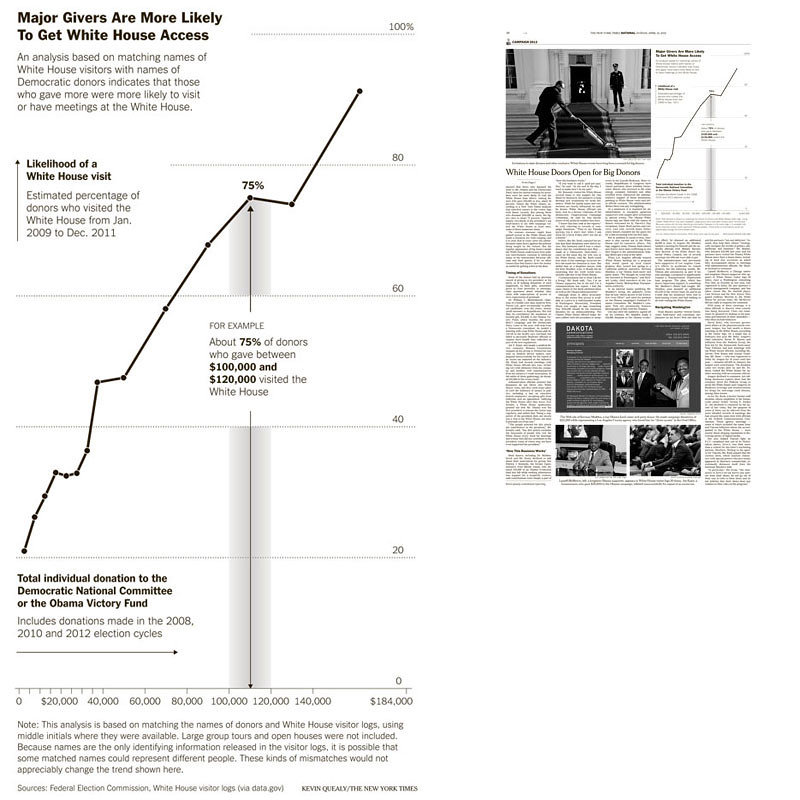
(It looks fine online too, but it’s sort of stranded on its own URL.)
Finally, as a disclaimer, the data plotted in these examples is slightly different than what went into print last week, as we did some manual tweaking on a handful of names, which moved a couple percentages up or down a tiny bit.
Look forward to seeing if any data visualizers Tweet silly animal names this week. I’ll go first…