Readers, aggregators and bored skimmers of chartsnthings will know that this is frequently a place for statistical sketches, many of which are made in R. Yet this is not because the New York Times Graphics department only makes statistical charts; more realistically, it’s because this blog’s frequent contributors stink at drawing. The department has a wide assortment of (frankly badass) illustrators, cartographers and 3D modelers, and I’ll try to include some more of their sketches in future posts.
In that spirit, my colleague Alicia Desantis agreed to share sketches from her recent Thanksgiving flow chart of turkey preparation decisions.
From Alicia:
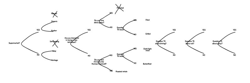
Our original idea was to qualify 80 different turkey combinations. What’s the difference between a heritage bird that is roasted whole, brined and air-dried and one that is butterflied, brined and air-dried? Supposedly these decisions have consequences, right? The final turkeys would be rated in a number of factors: juiciness, crispness, cost, time-prep etc.
But this way of thinking about the story severely limited the number of variables and bogged us down in meaningless differences. So we moved to a decision chart — this way we could more clearly articulate what was at stake in each individual cooking choice. It also left some room for basic “tips” and commentary — and gave us an opportunity to experiment with a different voice.
Instead of not talking to your family at the Thanksgiving table, why not take a look through her design process? First, some thoughts in Illustrator…
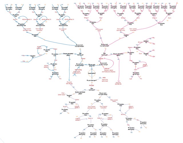
before moving to Omnigraffle…
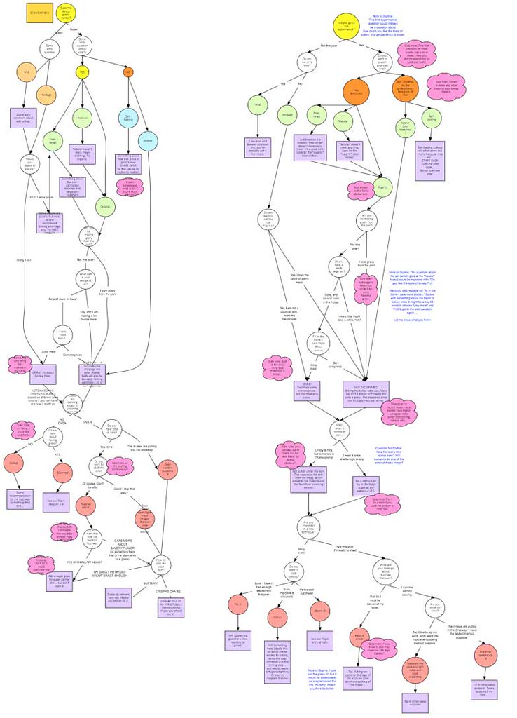 and cleaning up in Illustrator again:
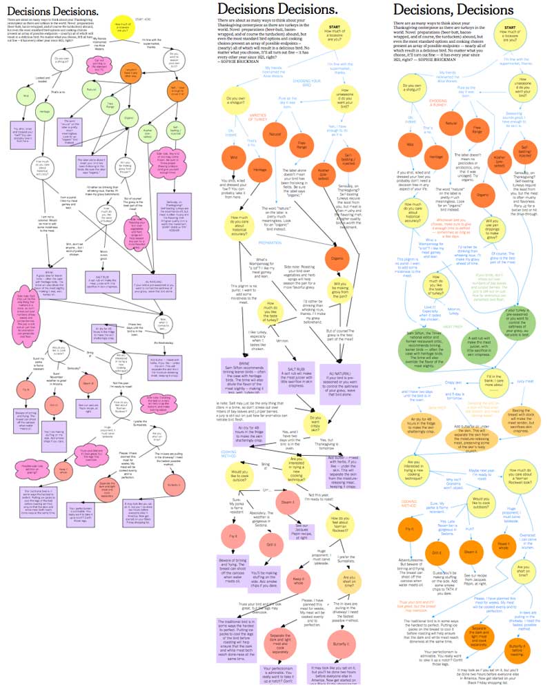
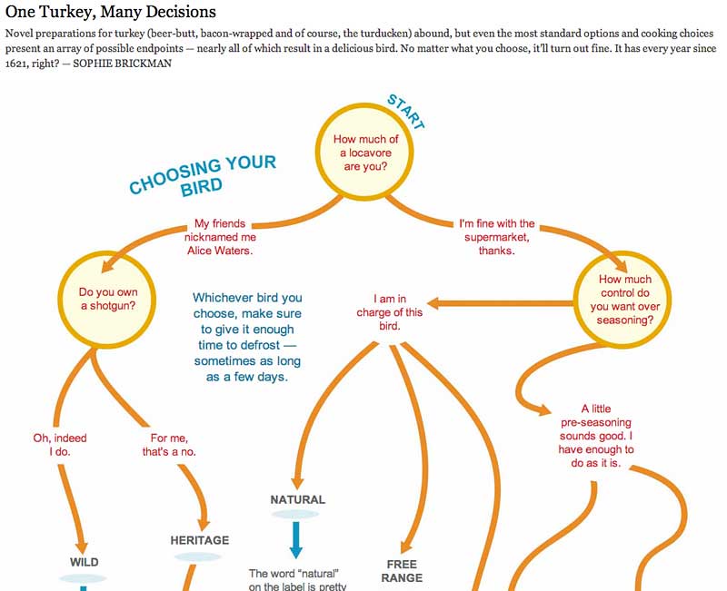
And the final version that made it to your browser:
See also the useful Thanksgiving-ertor and the Thanksgiving Help Line, made by a handful of designers and folks from Interactive News.