On Sunday, like 43,000 other people, I ran the New York City marathon. It was a great day and certainly the best-run race I’ve ever been a part of. (The stakes were low…the last marathon I ran was the Soweto Marathon in South Africa in 2005. The water ran out, but there was plenty of Coke.)
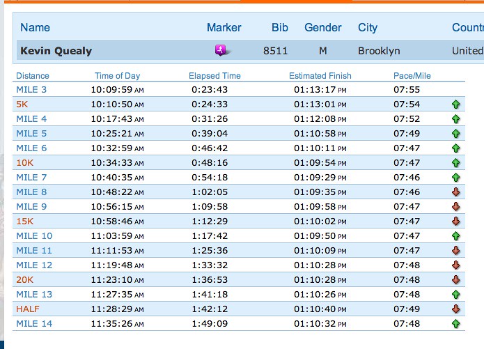
After the race, I heard from friends and family who tracked me through NYRR’s free “Track my runners” app. What surprised me was that they all were unanimous in praising my consistency throughout the race. They were all using the app to track my progress, which said I had 26 nearly identical splits, starting at 7:55 and eventually reaching 8:00. Here’s (half of) what they saw:
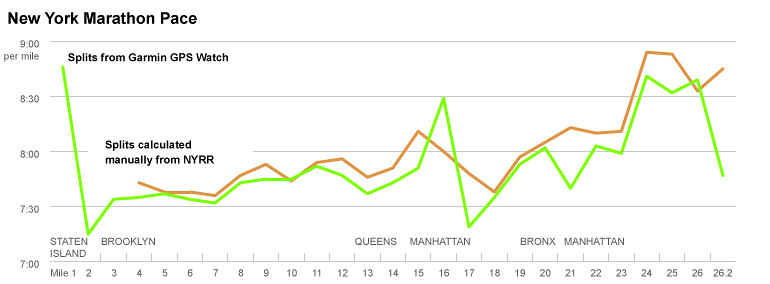
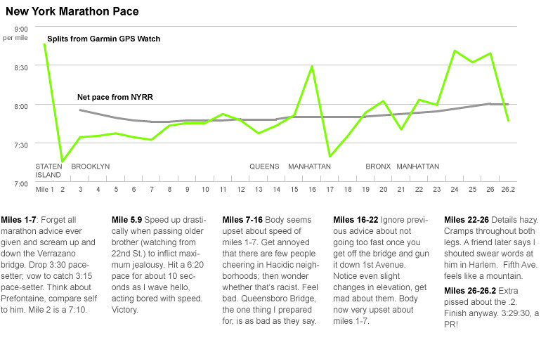
I charted it (the only move we graphics folks know), and it looked like this. (The NYRR’s first timing marker starts at mile 3.)
In reality, I knew this couldn’t be right. I had gone out too fast and suffered hard starting at mile 20, taking what could have been a 3:20 finish to a 3:30.
I compared my data from my GPS watch to the splits reported by NYRR. They were remarkably different.
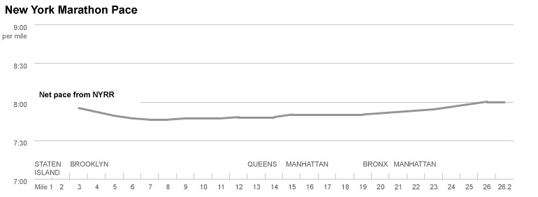
Only after a few emails with (a very patient and polite) Tom Kelley, NYRR’s director of race scoring, (who sent me a link on why GPS watches are inaccurate), did I realize that the paces they list are not splits at all – they are cumulative averages, or “net paces.” So, even though I basically melted on the pavement starting at mile 20, for the spectators online, it looked like I just added five seconds or so to my pace.
The point, aside from wanting something meaningful to come out of the three hours I wasted trying to understand my splits (at one point I considered the possibility that my splits were indeed consistent, and that the inaccuracy of my GPS watch was making me feel insanely slow) is an old graphics lesson: distributions are more interesting than averages. Or, for the sake of journalism, that averages don’t usually tell you anything unexpected or tell any surprising stories. There are loads of examples about this, but I think the department’s graphic about unemployment and demographics illustrates it best.
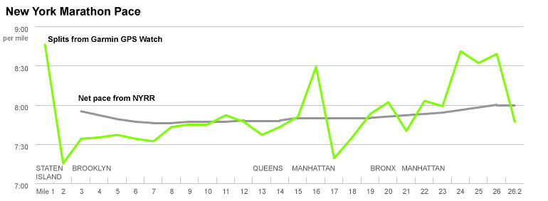
So, taking real splits and adding some annotation, you can get the real story of my New York City Marathon — a story, boring as it might be, that you can’t get with averages:
Also, if anyone’s interested in the difference between a cheap satellite watch (plus a guy not running in a straight line) vs. state-of-the-art distance measurements by world class race officials, see this. (I calculated them from the race “Elapsed Time” field.)