Last week, my colleague Monica Davey reported that starting in January, one party will control both the state legislature and governor’s office in 37 states, the highest that figure has been since 1952.
Numbers like that don’t always mean a chart will be good, but it usually means it’s worth at least checking out, so I got data from the National Council of State Legislatures, which had previously published a chart on their blog.
Getting data behind a chart you see on the internet isn’t groundbreaking work or anything, but it happens regularly in our daily work, and just because you can get the data easily doesn’t mean you can’t screw it up. Anyway, there are a number of forms this could have taken, so I thought I would share some.
The most basic chart to do here is to show the news: that the number of states with unified governments is at a 60-year high:
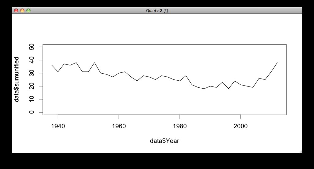
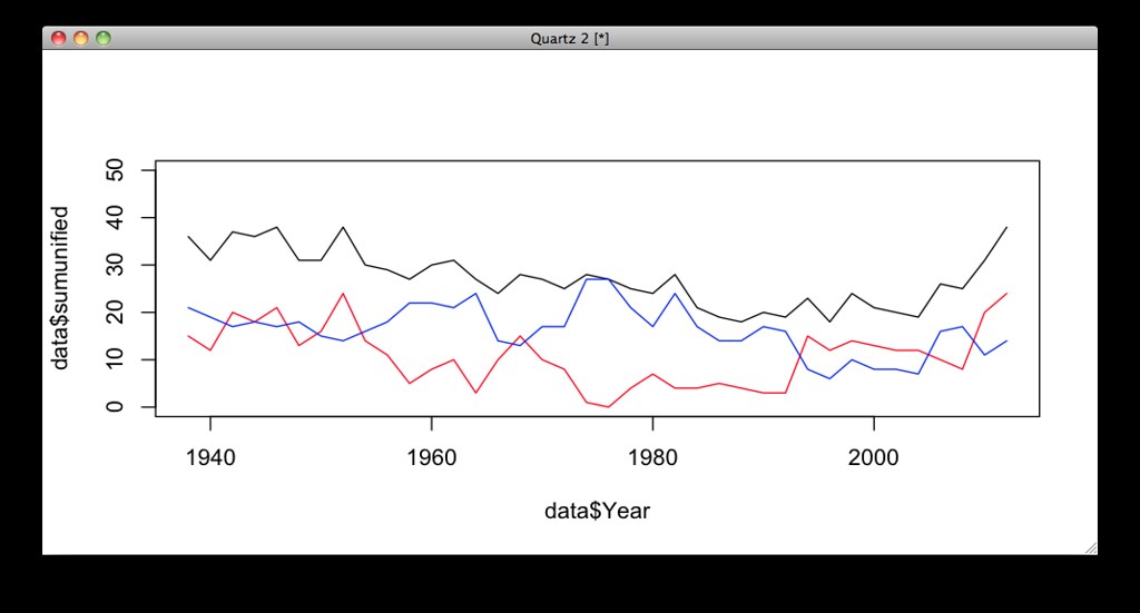
That does show the news, but not much else. Adding on lines depicting which parties have unified control per year (the black line is just the sum of the other two) helped a little:
But the lines look super noisy and I thought maybe someone would want to see the states more prominently. Here’s a waffle chart, with each square a state. (One cool byproduct with the area chart forms is you get to see the U.S. add Hawaii and Alaska – the “last” bump on this chart is when Minnesota switched from a nonpartisan legislature in 1972.)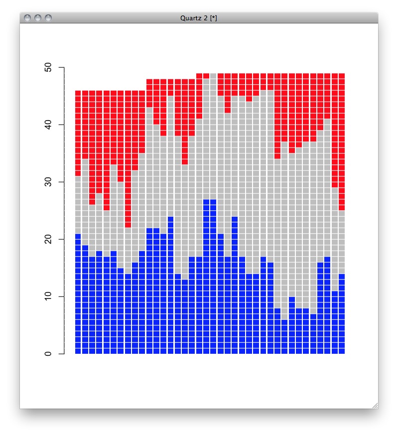
That might look a little better, but it’s not like you get to identify individual states or anything, and it takes up more space than it deserves.
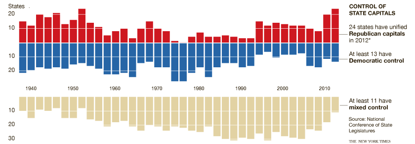
So a compromise was made, making it shorter, but in a similar style:
 One problem with both of these forms is that you don’t actually get to see the main point of the story: that there are more unified states than ever before. But I couldn’t think of a smart way to get all those, and I admit I liked being able to see the distributions.
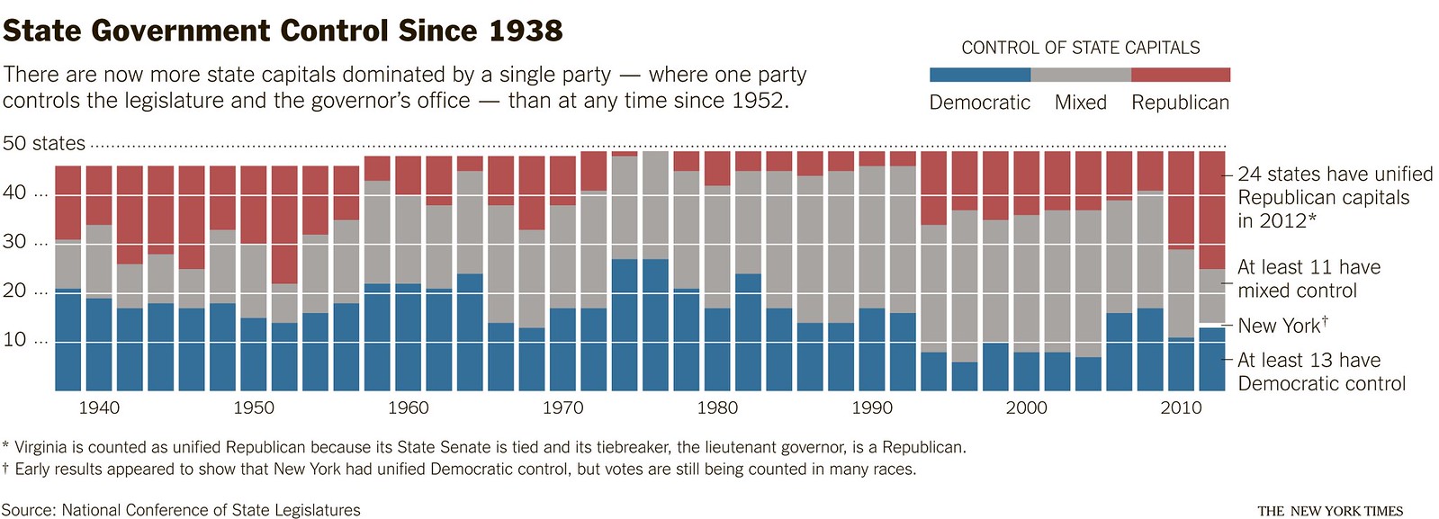
But another approach yet made it into the pages of the NYT. Charles Blow, an op-ed columnist and the paper’s former graphics director, liked the chart, and wanted to use the same data in his column. But he used it in a slightly different way. His approach lets you compare all three numbers by separating them into two charts:
So, given the news and the data, which form is best? Or care to make your own, better chart? The data is already online, but it’s in a cleaner format right here. I’ll happily post any charts as long as they’re politely submitted or worse than mine.
I’ll also post the (very few lines) of R code used to make these if you want to do some learnin.