On Thursday Facebook had the third-largest I.P.O. ever. In the week leading up it, my colleague Amanda Cox spent some time thinking how to best explain and contextualize this offering to readers. What follows is a series of sketches from Amanda, who shared her project folder with me for this post, and Matt Ericson, who edited the piece.
The universe of initial public offerings is seemingly simple: about 2,400 tech companies since 1980, compiled by Jay Ritter, a professor of finance at the University of Florida.
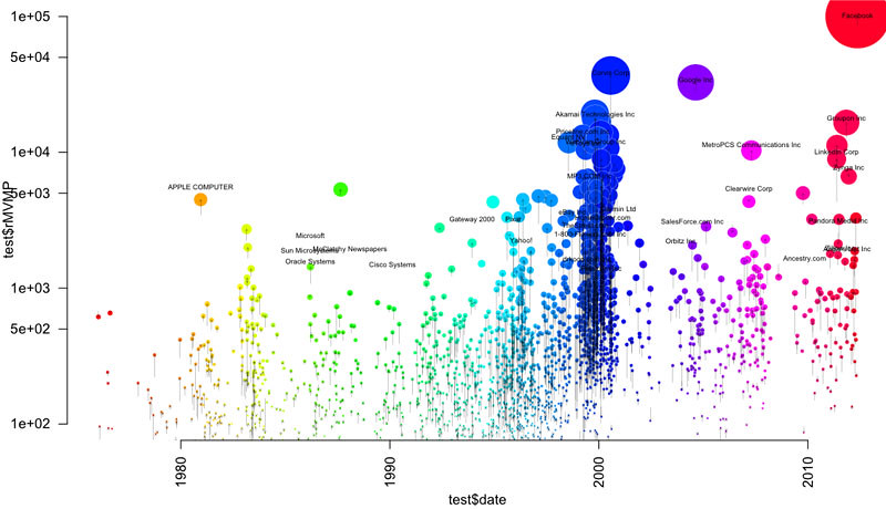
As a first step, Amanda charted the companies by I.P.O. date (x-axis) and value at I.P.O. (y-axis), colored them by their 3-year return. (The key’s not included in her sketch, but for these purposes, know that red is bad and green is good.)
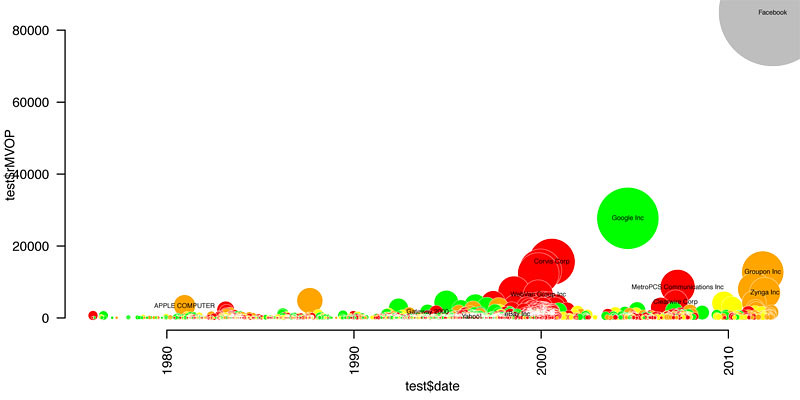
This chart’s not bad (even if, like me, you have low standards), but it doesn’t say much other than that there was a dot-com boom, that most of those companies didn’t do so well, and that Facebook is worth a ton of money.
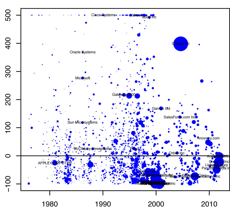
Next, a plot of 3-year return by I.P.O. date:
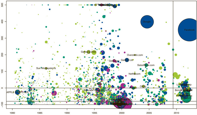
Trying to add in more nuance to this picture, shading the companies by the companies’ price-to-sales ratio at I.P.O. and including Facebook in a random position just for size:
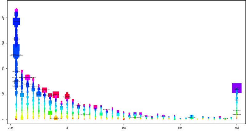
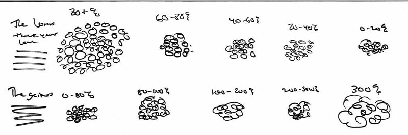
But rather than bringing clarity, it just sort of looked chaotic, even to the seasoned chart freaks of 620 8th Avenue. So she tried another form: a histogram of 3-year returns, colored by I.P.O. date:
Or the same chart but piled into three time periods (not that anyone asked me, but I really like this one):

By the way, even the queen bee of statistical charting screws up that chart the first time (be conservative with your “cex” values, folks):
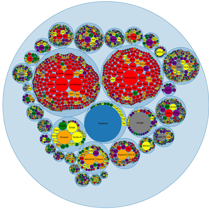
Another idea, vaguely reminiscent of the balloons from “Up,” is sales vs. market cap at I.P.O. colored by year. I won’t lie, I don’t get this one:

Going back to time series, which many readers are more accustomed to reading and understanding, Amanda focused on one thing that always gets talked about with IPOs: almost all of the companies have a bump in market cap after their first day of trading. So she charted the “trails” of companies over their first day on the market (a log scale makes percentage changes look the same):
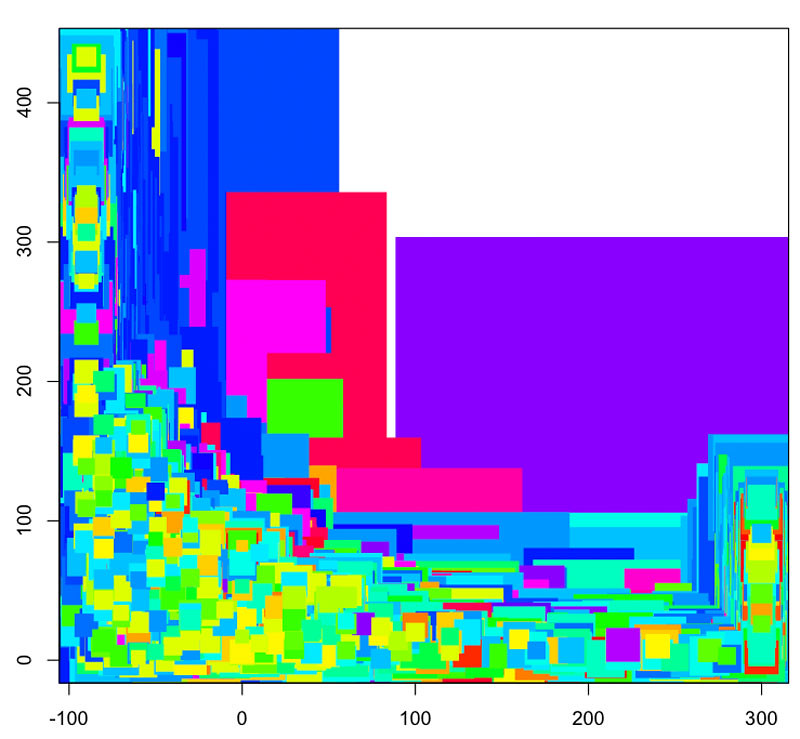
The trails felt promising, so she pursued them with sales, too. (Along with some screw-ups.) Again, full transparency here, I don’t get this one either, but since there are some screw-ups in there I think we’re safe:

At this point, there were a lot of charts made, but no clear answers about form or the best things to show. Matt Ericson, eyeing the looming deadlines, looked through Amanda’s analysis and offered a compromise of sorts, related to the histogram she had generated earlier, and suggested a slightly different form:
Which turned into this:
And, ultimately, into this:

If you’ve seen the web version, though, you know it doesn’t look like this. [Amanda thinks print graphics can be smarter than web graphics.] For one, the browser window doesn’t give us this kind of space. But the medium itself plays a part too. Online, if you’re not engaged in 10 seconds, you’re not going to stay on the page, so they needed to keep it fun. For that, Amanda and Matt got some help from three (pretty badass) colleagues: Jeremy Ashkenas, Matt Bloch and Shan Carter. Together, they made an interactive chart that stepped through a handful of the steps above, slowly explaining the dataset, with each step building on the last:

A couple major design processes are at work in this piece. First, sketching with data is massively important. Only by looking at the data in multiple forms, from different angles, did this group of visual journalists really peel back what was most interesting about it. Here, we saw histograms, crazy arrow charts, bubble charts, time series and others – all shaded with different variables. All but one, more or less, got cut.
Second, and related, is that you go with the chart you have when the deadline comes – or that you’re only as good as the last chart you threw away. (Her words, not mine.)
To be quite honest, Amanda wasn’t thrilled with her graphics that went in the paper and online. (She is always searching for The Perfect Form, whether or not it’s there.) If the I.P.O. were delayed another week, there would be another dozen charts in the trash can and maybe something else would be the last good chart. But you go to print with the charts you have, not the charts you want. So, you know, make a lot of them.