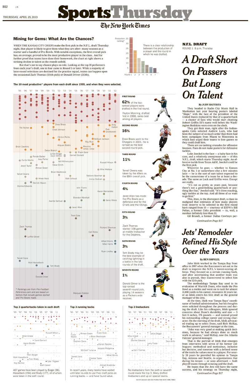
Last week we published an interactive graphic about the N.F.L. draft. Our goal was to show an odd reality: even though N.F.L. teams do tend to pick the “best” players early in the draft, there’s a tremendous amount of chance involved. The best 10 eventual N.F.L. performers will not be the first 10 players drafted – or even close.
How to know that both of these are true and decide which is most important? We used draft and performance data from pro-football-reference.com. (One note: N.F.L. performance is hard to measure across positions – how do you decide if a tight end is “better” than a linebacker or a defensive tackle? Most analyses use a combination of games started and pro bowls; the one developed by pro-football-reference uses both of those but has some fine-tuning by position.)
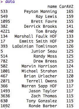
So, for for every pick in the draft, we have one number encompassing their N.F.L. performance. Here are the top 20 since 1995:
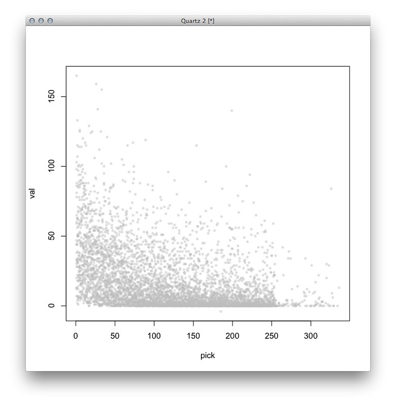
Here’s a first sketch, where every dot represents one player. The Y axis is “how good” every player is, and the X axis is where in the draft they were selected. I actually screwed something up here – there aren’t more than 250 or so picks in a draft – but otherwise the distribution is more or less right:
 My colleague Mike Bostock cleaned this up by coloring the picks by round and adding some labels:

Although that shows all the data, it’s too noisy to really interpret. Wanting to simplify this, I tried taking the average of all players who went at a certain round and certain pick – here, each dot represents the average value of all players at a certain pick (for example, the players drafted at Round 1, Pick 1, or Round 2, Pick 13). As before, the dots are colored by round:

The dot on the top-left represents the average value of all first picks in the draft since 1995 – on average, this group, which includes Peyton Manning, Cam Newton, Andrew Luck, Michael Vick, Keyshawn Johnson and others, clearly outperforms the other picks. (This is might be obvious, but then again, the group also includes Tim Couch and JaMarcus Russell.)
I admit I liked this chart more than I probably should have. (My colleagues corrected me!) Averaging this way is a little misleading because every round doesn’t have the same number of picks (the league has grown and there are extra picks at the end of each round, which leads to some funny business with the math), and hiding the distribution oversimplifies things a little. But this chart does make a simple point – the better players tend to go first.
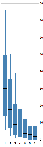
Instead, Mike offered a boxplot, which shows the distribution without being so noisy:
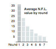
Even this was a little too busy for the point we wanted to make, so we settled for a small bar chart.
What we wanted to focus on was the reality that there’s much more randomness in the draft than people realize. Cade Massey and Richard H. Thaler, behavioral psychologists, analyzed the draft and found that not only is there no persistent skill among teams in picking players – teams have good years and bad years in equal measure – but that across all players and positions, teams only picked a player better than the person who went next at that position 52 percent of the time. Their academic paper is here, but Massey explained this in a much more accessible way in a recent talk at the Sloan/MIT sports analytics conference.
I took a stab at replicating some of their findings just to see what it would look like. Here’s a rough chart of the percentage of teams picking a player who ended up being better than the guy drafted after him at the same position. For example, if you chose Peyton Manning (Pick 1 in the 1998 draft) over Ryan Leaf (Pick 2), your guy is better than the next guy at that position, but if you chose Spergon Wynn (Pick 183 in the 2000 draft) over Tom Brady (Pick 199), you did not. (Sorry, Cleveland Browns.)
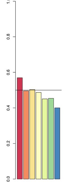
Simply put, teams don’t pick the “right” player as often as you think, and tend to do better than a coin flip only in the first round. This chart goes under 50 percent after the third round, but that reflects some noise in the data towards the end of the draft – most of these players don’t actually get in the game, so it’s not very meaningful to say that one benchwarmer is marginally better than another. But this concept is hard to explain in a chart like this (the title would be something like “percent of players who were better than the next player at the same position by round”), so we took a simpler approach.
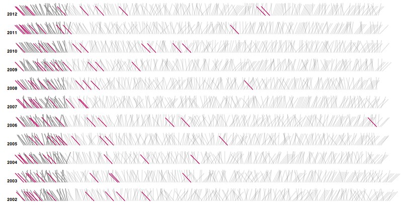
I had been tinkering on a version of a chart I had that showed where the best eventual players were drafted:
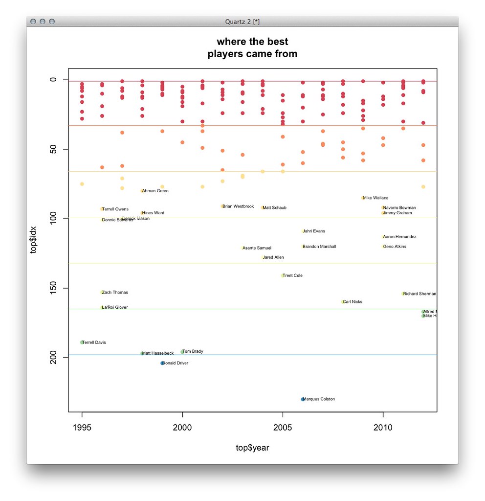
This chart highlights where the 10 “best” players in each draft were picked. My colleague Joe Ward thought it would look good in print, where we have more space, and this chart ended up closely resembling what was eventually printed:
Online, Shan Carter suggested an interface that showed this uncertainty with two sentences: the percent of the best players that came in the first round and the percent that came after:
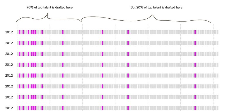
A slider and about a hundred commits later, you have an tool that lets you explore where the best N players from the draft came from every year.

Mike also made a similar implementation based on the Fisher-Yates shuffle, which is a thing I learned about when he showed me, but it wasn’t the right application for this data, and anyway it was getting too late to change our minds:
These charts and sketches were made in R and D3. Normally, at the end of these posts, I write about how other people implemented the best parts of this graphic, but this time it’s especially true.
One of the great things about working in a department with a staff of 25 people is that you can be in big trouble three days before something publishes. Then you make a phone call to San Francisco and everything works out fine.