Here’s a (still getting tweaked) R tutorial for the charts in the last post. Here’s the data you’ll need to download.
Set your working directory to wherever you want to work out of (usually a project folder)
setwd("/Users/pathToMyFolder...")
Next, load the data. Any format is fine, but our data is a tab-delimited .txt files, so we can use read.delim (here, my data is in a folder called “data,” but yours can be wherever).
data <- read.delim("data/states-data.txt")
Make a new field in your data frame that is the sum of unified states:
data$total.unified <- data$Unified.D+data$Unified.R
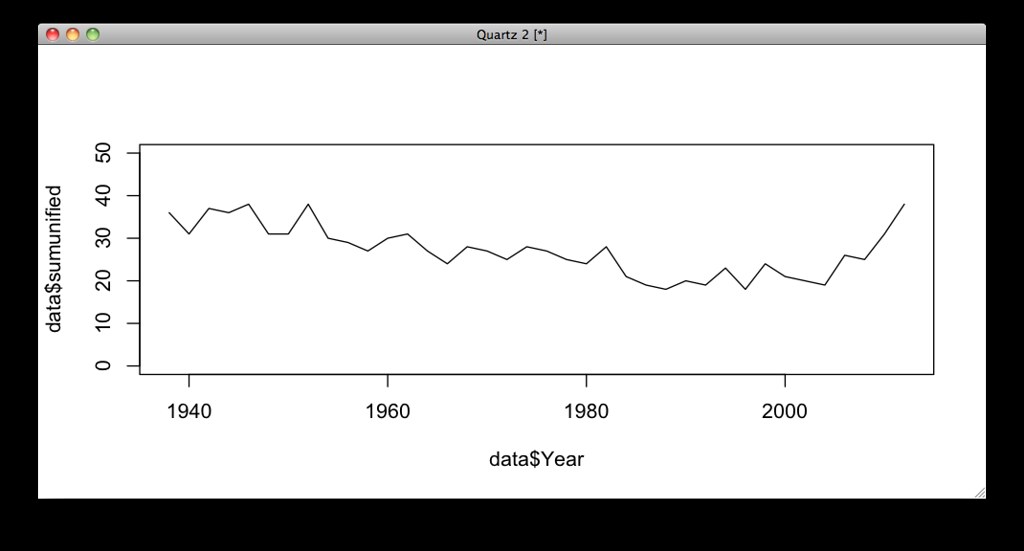
Now our data is ready to chart. It’s just one line of code to make a plot of the number of unified states over time, with “Year” on the x axis and “total.unified” on the Y axis:
plot(data$Year,data$total.unified,type='l',ylim=c(0,50))
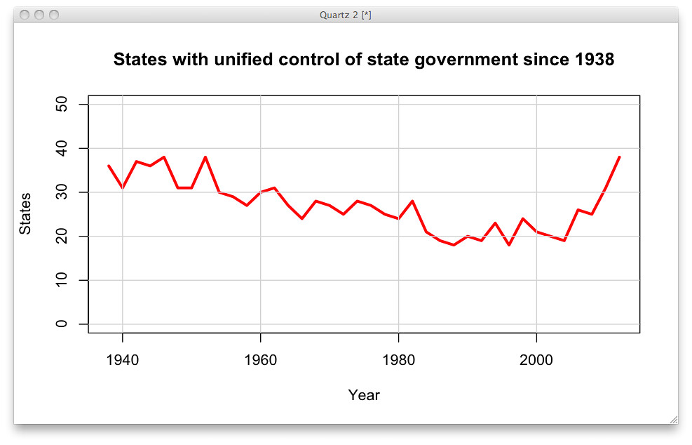
The same plot, with extra arguments to clean it up a little:
plot(data$Year,data$total.unified,type='l',ylim=c(0,50),xlab="Year",ylab="States",main="States with unified control of state government since 1938",col="red",lwd=3) abline(h=c(0,10,20,30,40,50),col='lightgrey') abline(v=c(1940,1960,1980,2000),col='lightgrey')
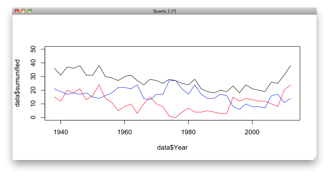
Adding more layers onto the plot, drawing lines for Democratic- and Republican- unified states. (In general, “plot” makes a chart and “lines” add to an existing plot.)
plot(data$Year,data$Divided,type='l',ylim=c(0,30)) lines(data$Year,data$Unified.R,col="red") lines(data$Year,data$Unified.D,col="blue")
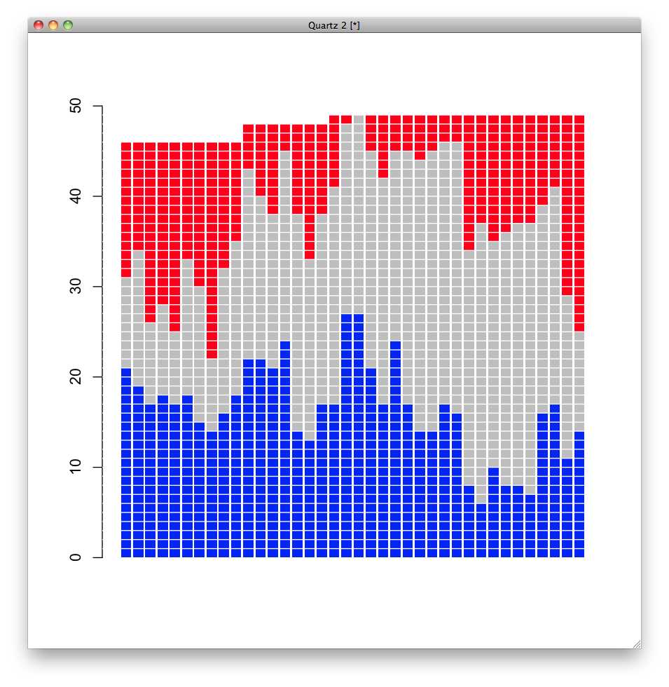
Now we’ll make a barplot instead. The syntax here is a little weird, and I had to get Amanda to fix mine originally, but it’s not so bad. Basically, our data needs to be transposed and reduced to just the columns we want to plot. You can do this in one step, but for clarity I’ll break it up here. It looks like a waffle chart just because of the horizontal axis lines, but it’s just a barplot.
#just the numbers we want to plot data.we.need<-data[,c("Unified.D","Divided","Unified.R")] #a simple reshaping, transposing our data transposed<-t(data.we.need) barplot(transposed,ylim=c(0,50),col=c('blue','grey','red'),border=F) abline(h=c(1:50),col='white')
We end up doing the same plot for the final output; it’s just shaped differently and has fewer axis lines. We’re also saving it as a pdf in the dimensions we want:
pdf(file="stacked-bars.pdf",width=8,height=5) barplot(transposed,ylim=c(0,50),col=c('blue','grey','red')) abline(h=c(10,20,30,40),col='white') dev.off()

Ship that!