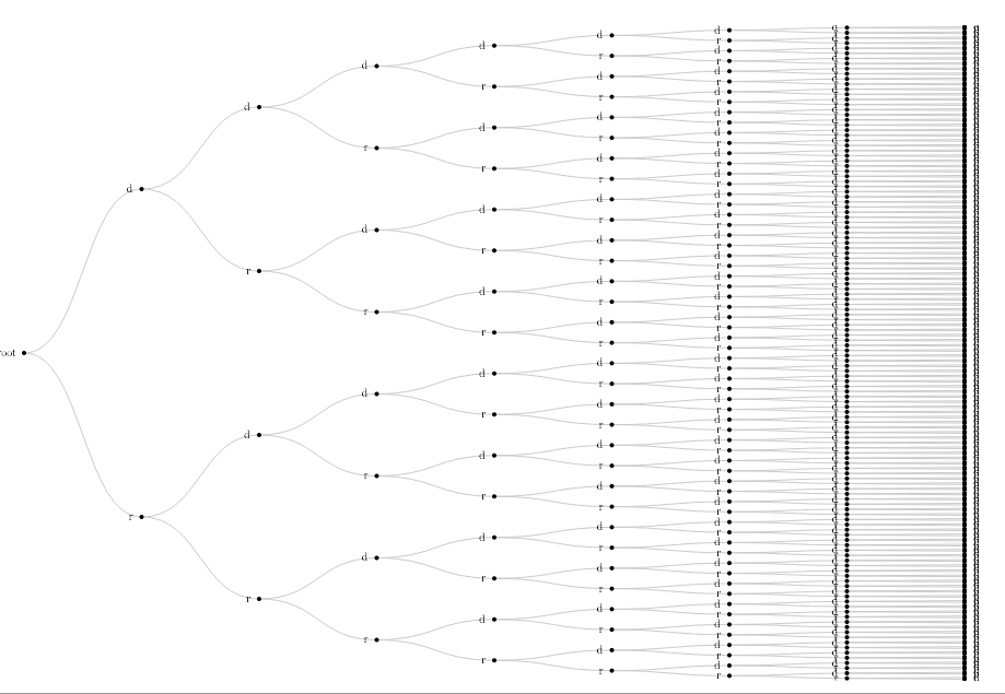
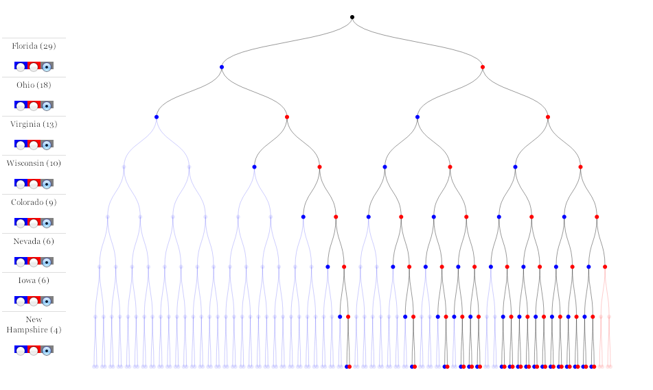
Probably the best-known of the department’s graphics this election season is Mike Bostock and Shan Carter’s 512 Paths to the White House. Instead of posting on this in detail, I’ll just put up a few images and direct you to some stuff that’s already out there.
First, an interview on Source with the authors.
Next, Shan Carter’s recent talk at the Visualized conference in New York. (There was apparently a burst of applause when the first slides for this graphic came on the screen.)
These photos are from that talk, but there are dozens more if you read through the whole thing, which you should, obv.
And the final graphic, which was wired up to results on election night.
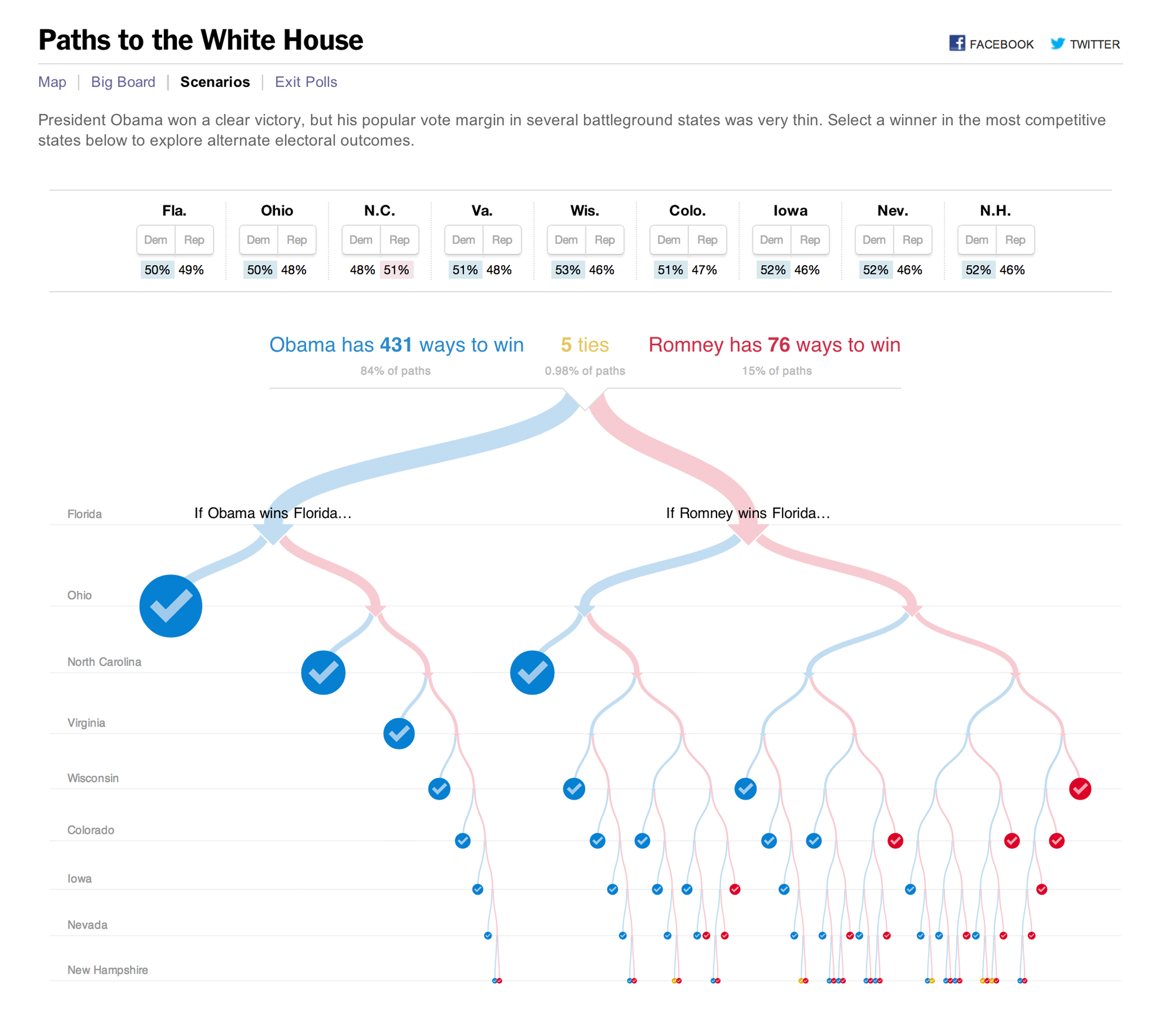 The only meaningful footnote I can add to this is that Mike Bostock described programming the animations as “really, really hard.” I read that to mean I need to give up programming immediately, but your mileage may vary.