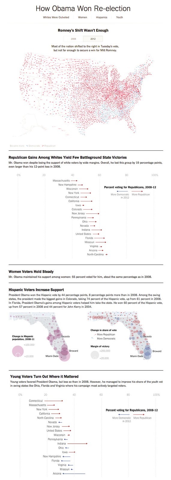
Election night is (mercifully) over. Aside from the dozens of maps, tables and charts that ran live during the election, including a bunch live graphical updates to the live blog (some of which I reblogged here last night), the department also published a more analytical piece this morning.
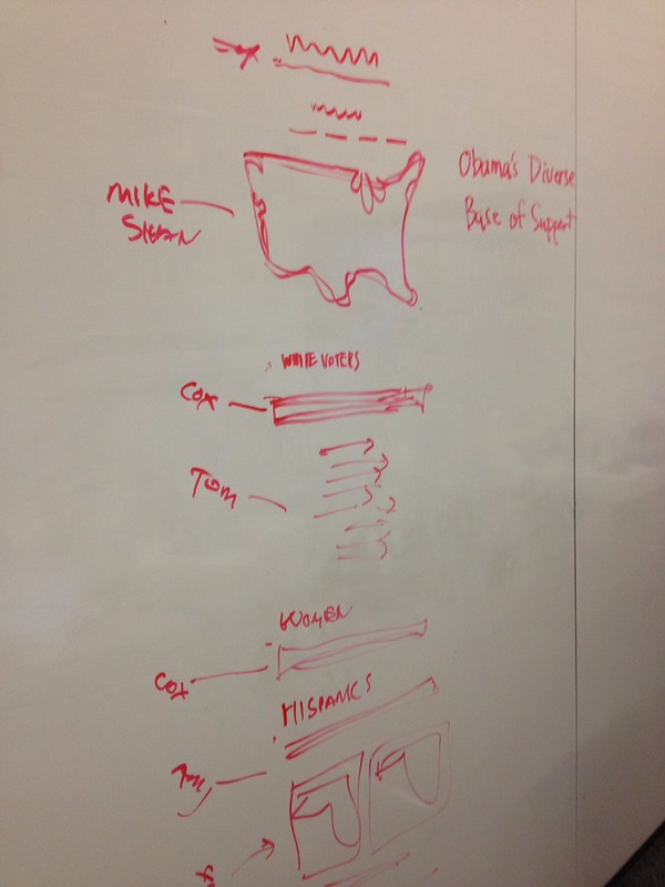
There had been many sketches and ideas about what to do for the “How the Winner Won” graphic (Amanda made at least 40 ideas, some of which she might share someday), but by the end of the night there was a pretty good plan.
This sketch, by Steve Duenes, doesn’t show all the research or failed ideas that got us to this point, but it does show a clear plan that was eventually executed overnight by about ten graphics editors. The main map, by Mike Bostock and Shan Carter, was a variation on earlier maps we had published, including the map of House shifts in 2010 (which itself was part of the Times’s election app this year) with some clear inspiration by Fernanda Viégas and Martin Wattenberg’s wind map.
Anyway, here’s the sketch:
And what was on the NYTimes homepage this morning: