A few months ago, during the Euro 2012 soccer tournament, I remember watching the Spain-France match, and like everyone who’s ever seen Spain play, was really surprised by how easily they outpassed their opponents. I wanted to make a chart of their passes – not a network diagram of who passed to who, but a chart of where the passes themselves were. My colleague Xaquín G.V., who had done many of our soccer visualization in the World Cup in 2010, told me to talk to Opta, a company that specializes in this kind game data.
A few emails, phone calls and data monkeying sessions later, my colleague Jeremy White and I had made charts for every player, highlighting short passes, that we really liked:
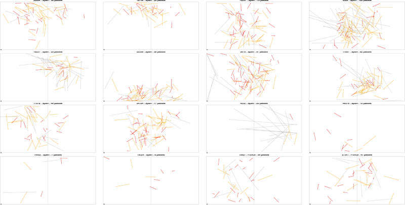
Alas, there was not enough time to finish it, so on the shelf it went.
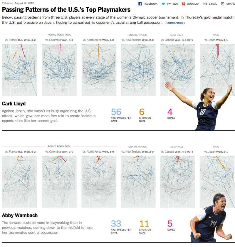
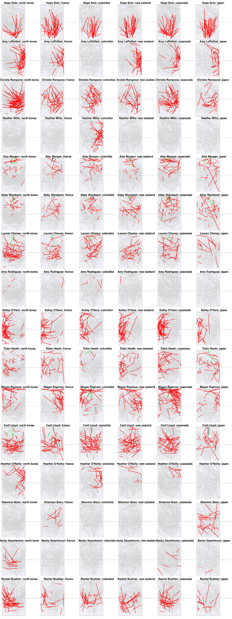
But when the U.S. women made it to the Gold medal match, the code was right there to use again. Jeremy was busy visualizing the Twitter Olympics, but Xaquín and Amanda Cox pitched in some soccer knowledge and gross XML parsing so we could make and interpret similar charts. After a lot of trial and error, we had mapped all the passes for all the U.S. players over the course of the entire tournament (made using R’s basic plot and segments commands):
We still needed some help understanding it, so we got in touch with Jay Cooney, an assistant coach at Stanford who had coached a some of the players on the national team. But instead of just asking him “what did you think of the games?” we were able to ask “what do these charts tell you?” Giving our source all the charts ahead of time ultimately helped us choose who to highlight and made for much more useful annotation. There certainly could have been more, but we were on a tight deadline and ultimately had to turn it around, start to finish, in about 12 hours. Here’s the final graphic, with some nice design touches from Xaquín: