Last week the Times published their interactive electoral map. Although a medium-sized team of reporters, editors, designers and developers (including, but not limited to, Jeremy Ashkenas, Matt Ericson, Alan McLean, David Nolen and Derek Willis) had a hand in designing and building the project, Shan Carter did much of the developing of the main visualization, and he agreed to let me post some of his sketches here. (I had no hand in this – I’m just the image copy-paster this evening.)
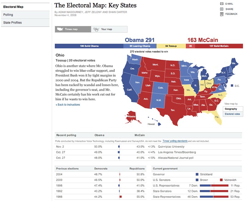
First, a look back to the Times’ electoral map of 2008:
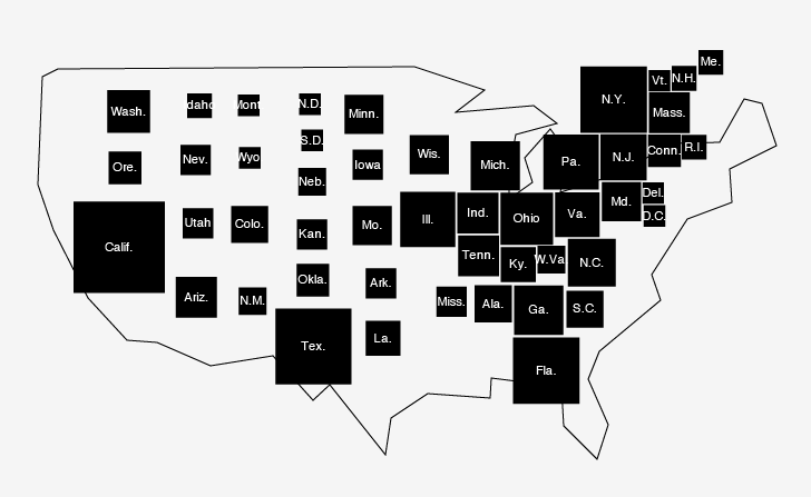
You’ll notice some similarities – there is analysis for every state and the option to share your own map. But they wanted to explore some different options this year, too. First, Shan started by making a cartogram in Illustrator, overlaid on a (pretty terrible) hand trace of the US:
And then slowly tinkering with it:


One idea was to take the geography out of the graphic completely:

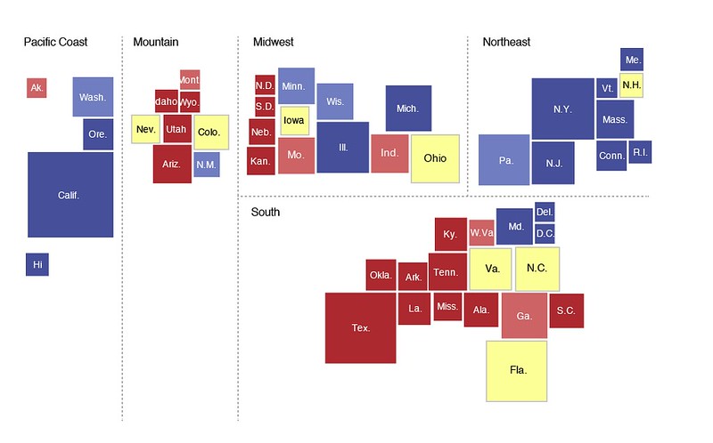
Or at least minimize it further by dividing states into regions:
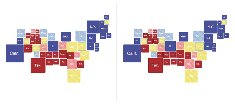
Another was to compare two maps side-by-side, similar to the "split screen" view of the Senate in 2008:
But no one was really super thrilled with maps as the main conduit for the analysis. Instead, they decided on minimizing the geography and using “bins” for states. (Shan has sort of been obsessed with “bins” since 2008, when his dream of having states magically fall into buckets on election night ultimately didn’t pan out. I personally had to cheer him up after that and it was not pretty.)
Anyway, an early prototype of that concept:
 And how that part of the graphic ultimately looked:
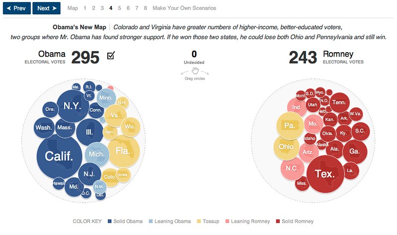
If you’ve seen this piece by now, you’ll notice that they didn’t make just one decision – they expanded on a few of them in a compelling mix of interactive and linear storytelling that told a few different stories and also let you make your own and share it wherever you wanted.
It’s also a fun insight into Shan’s workflow, which is to mostly experiment directly with markup rather than with flat outputs from R or Adobe Illustrator mockups, which many of us do. (OK, technically, he tells me the cartograms, being more art than science, were hand-made in Illustrator and then their xy positions were exported to D3, but still, he’s on the record saying “mockups are for suckers.”)
Also, this was made using D3 and implemented a technique that let the graphic function properly even in Internet Explorer 8. (A sharp guy named Jim Vallandingham chronicled this in extreme detail if you’re interested in doing this sort of thing.)